It may speak to my superficiality or materiality or some other -ality, but whenever I find myself completely overwhelmed by whatever I’m doing — like, say, trying to turn various stories from my life into a memoir — I like to take more than a minute to lose myself in everything around me.
Whether I’m in our apartment or a coffee shop or out walking around, I enjoy dissecting the designs that’re writ tangible all around us. What they say about us, our lives, our interests.
How they’re charged with the political.
The unexpectedly beautiful.
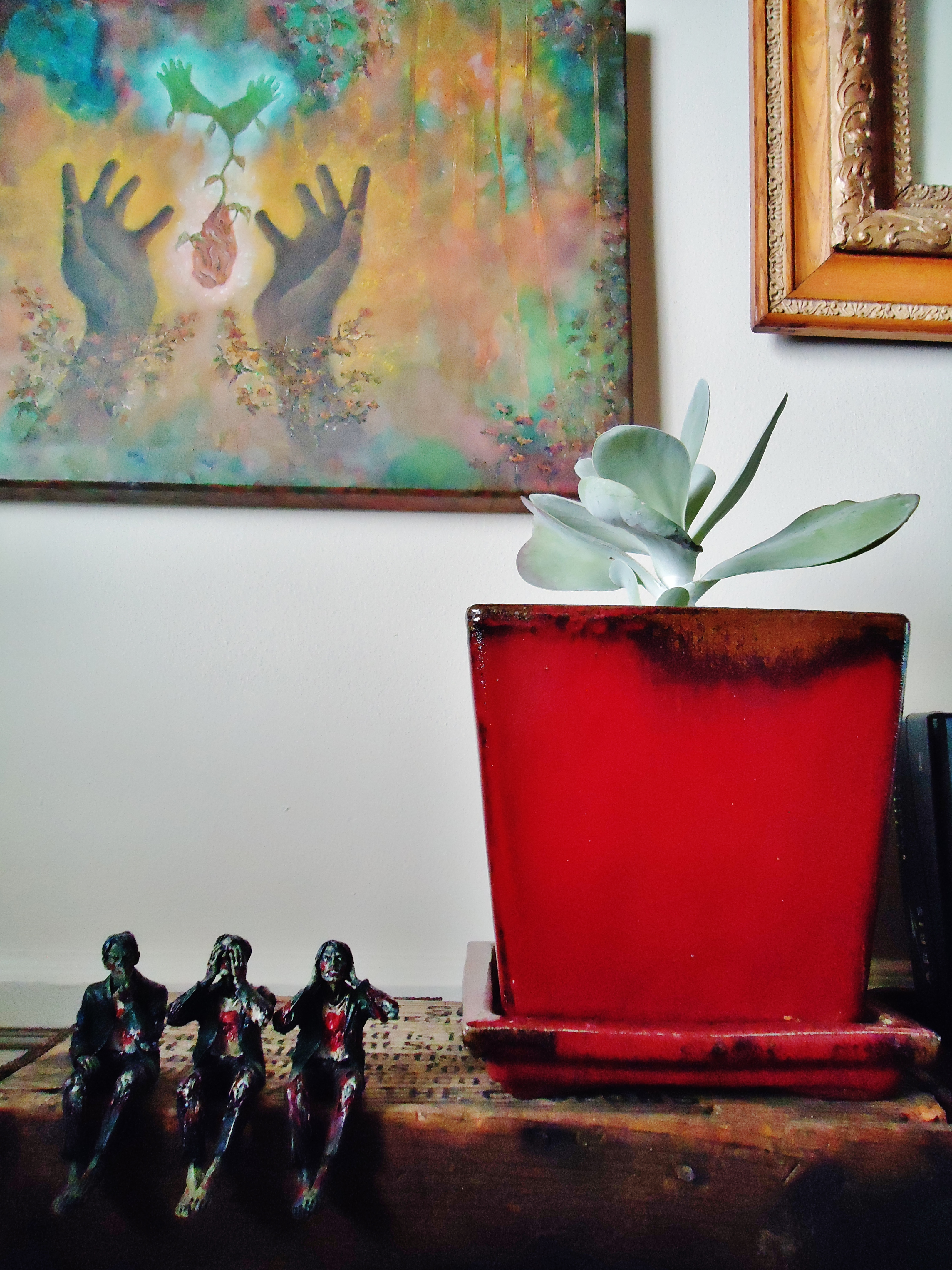
The humorously macabre.
The whimsical.
How everything we’ve built this past year has been layered with texture and life.
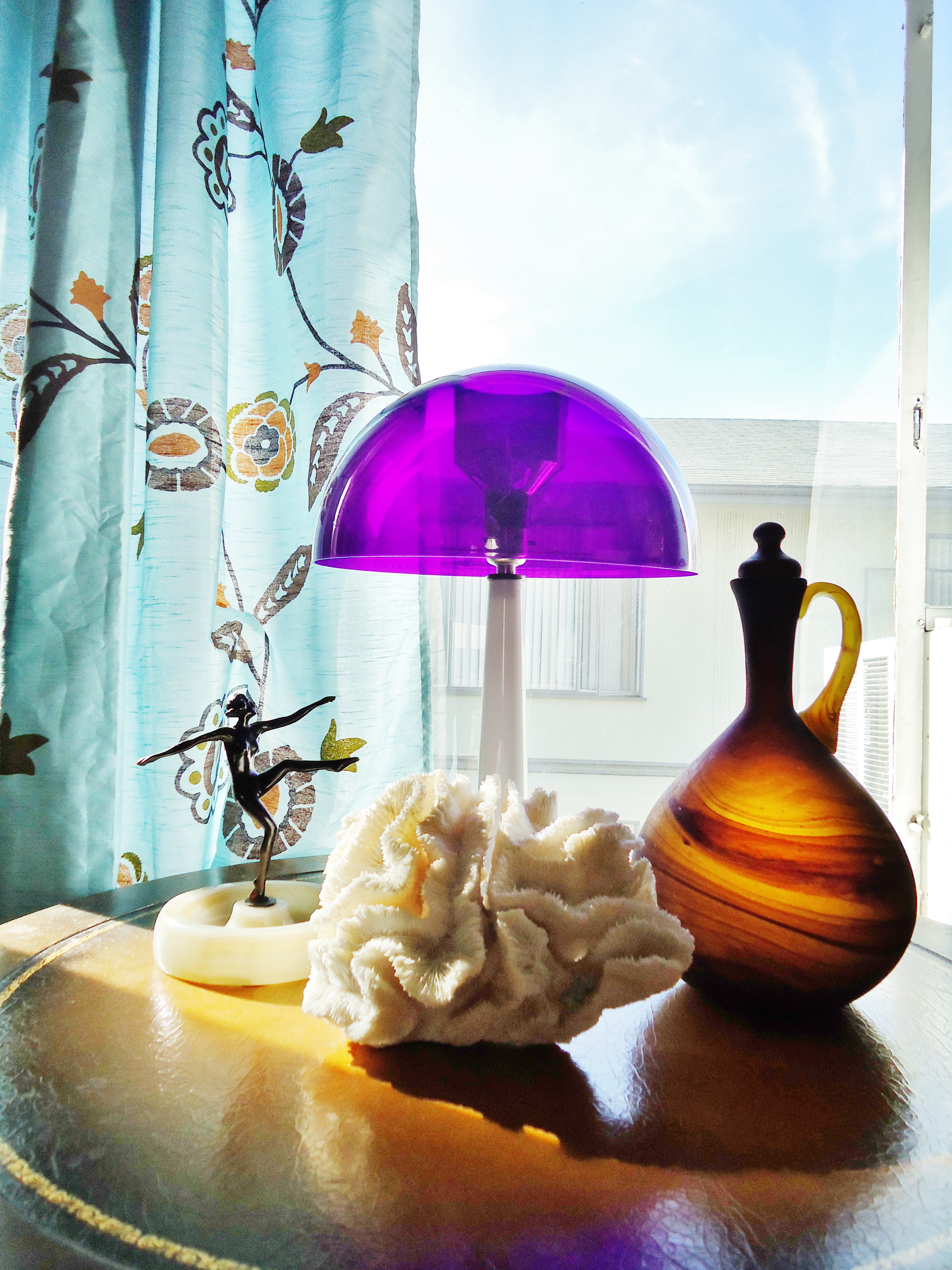
And while I know I’m no design guru, it’s funny to hear how certain things we’ve done in our apartment resonate with others. How adding a bit of this or that brings the whole room together — makes it actually feel like a home.
I’ve written plenty about how much I love design. But our latest digs are definitely the most mature and fun to date. And while its size might not compare to our massive Raleigh apartment, it’s still full of vitality.
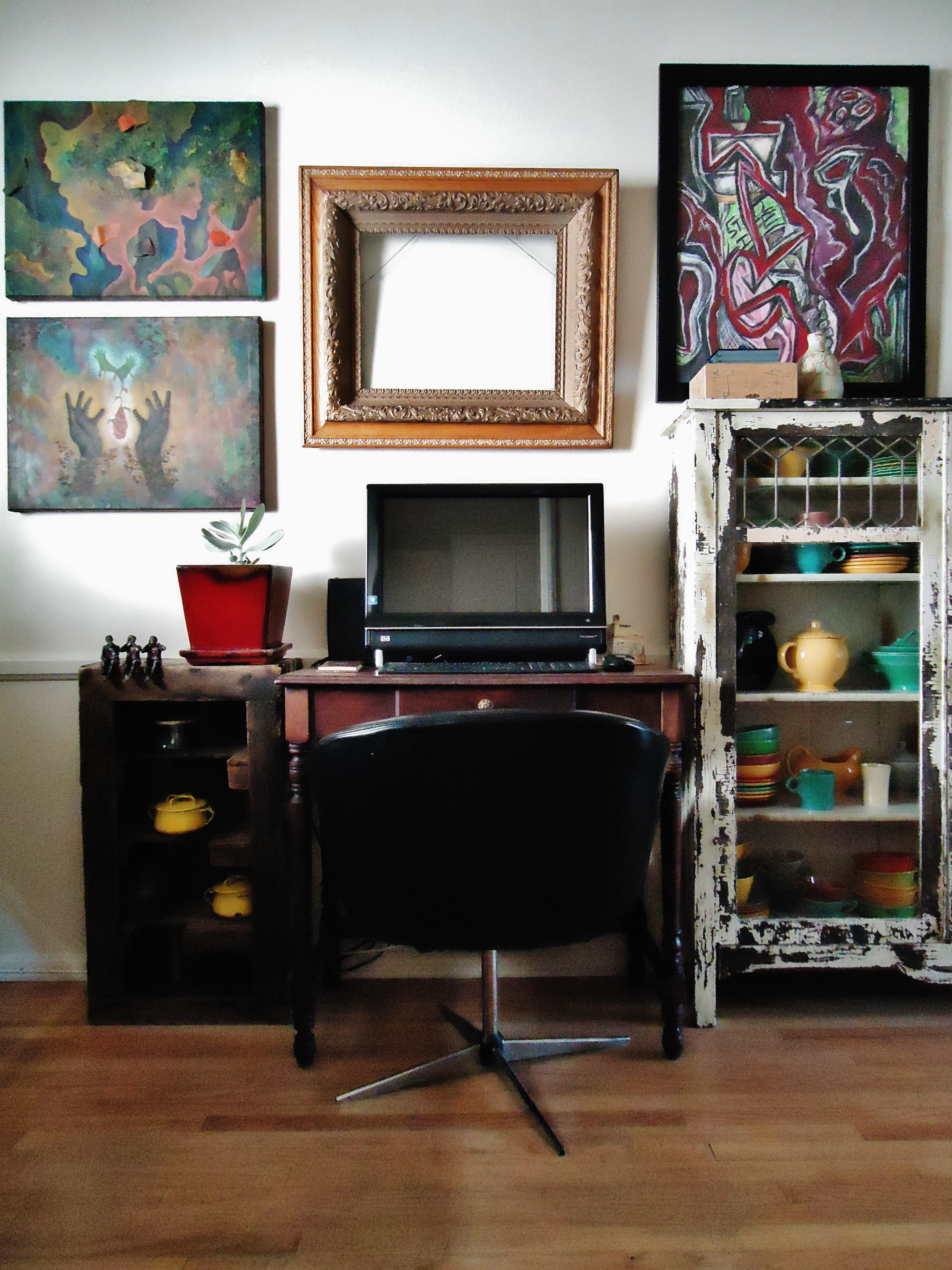
When we first moved in, between staving off panic attacks and hauling things up the stairs, I had no idea how we were going to make this space work — what with its odd layout, the awesome but huge windows taking up valuable wall space, the tiny kitchen, and the dearth of storage. But after we culled a bit more and got creative with the space, things started coming together.
And I started embracing certain design faux pas I’d worked to avoid in the past.
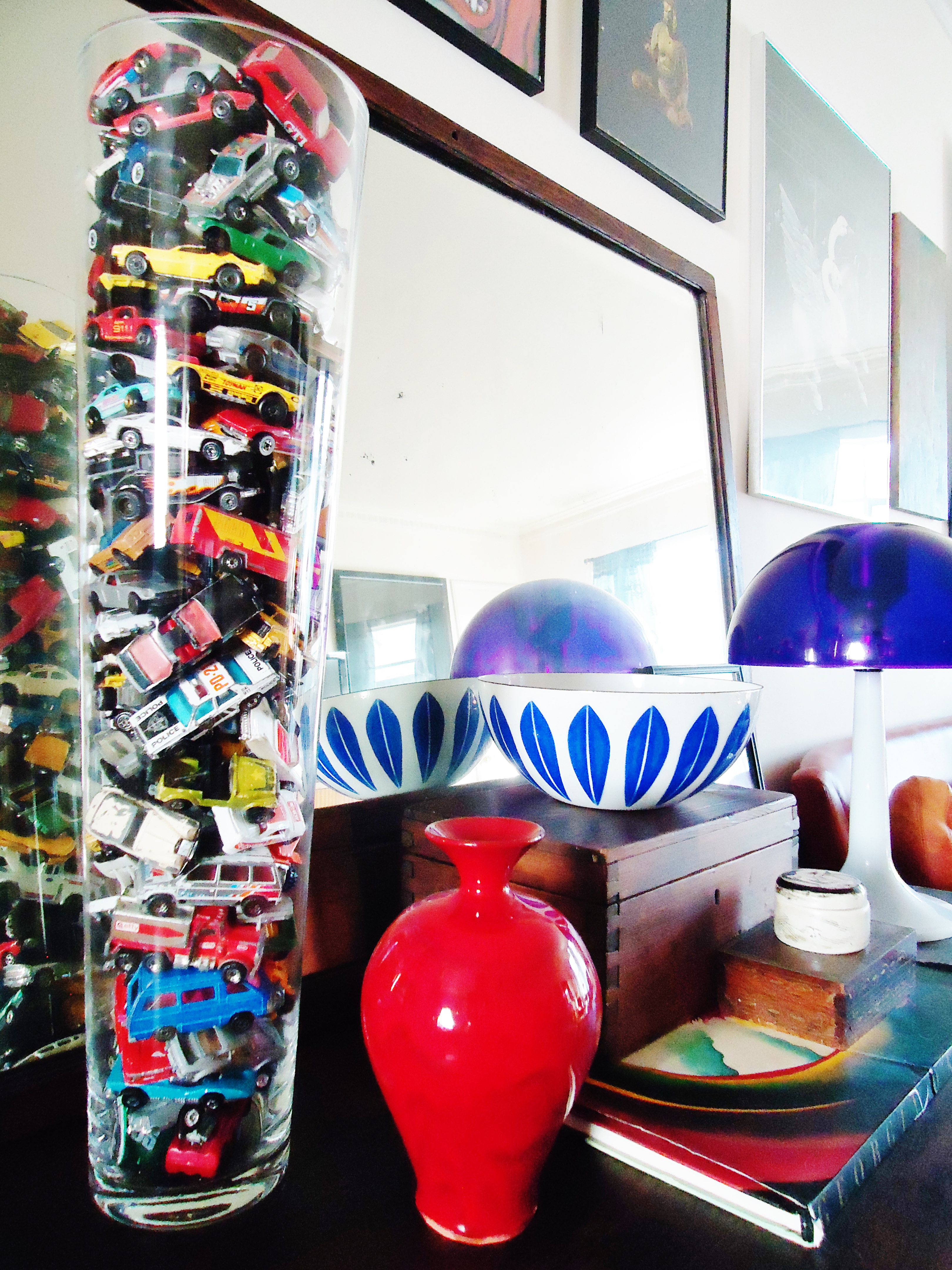
(1) Don’t orient everything along the wall. When facing a lot less space, sometimes you have to orient most everything along the walls. But by floating a few pieces in the middle, and experimenting with different heights and textures — wood and metal and glass — things still work.
(2) Don’t overload the walls with art. HA! That’s hilarious. After perusing photos of past apartments, I realized how awful — and overwhelmed — the walls looked: I’d tacked every possible thing to the walls with no real plan in mind. But you know what? When you’re unpacking boxes in a confined space and just want things up and off the floor, you have to get creative. So we pulled just about every piece of art out, made our cases for displaying some and boxing up others, and just started hammering. At first, I thought it’d look horribly overdone. But now, I like it — it’s a lot, but not too much.
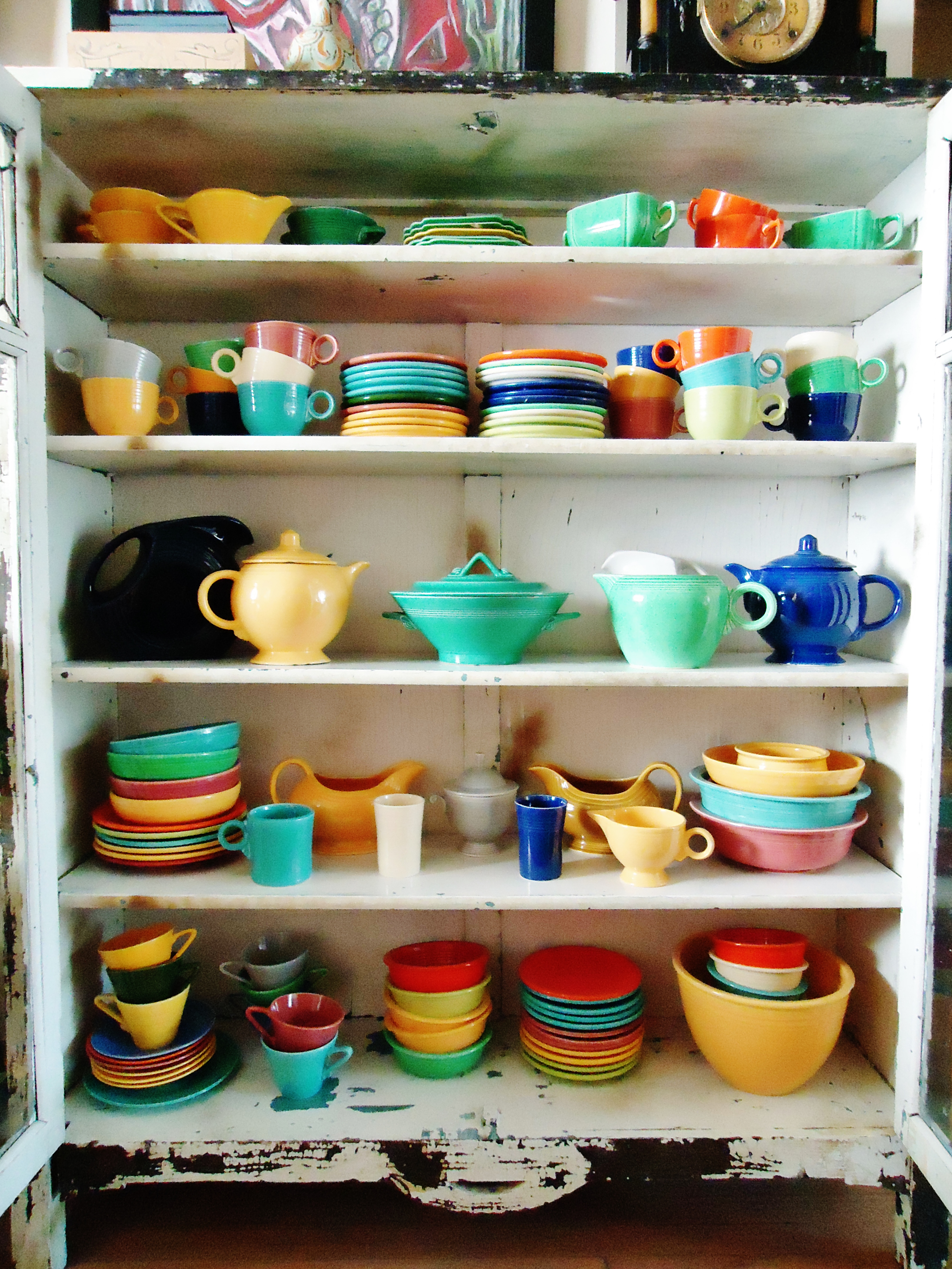
(3) De-clutter every surface. Now, I generally loathe clutter. But if done in a contained way, it can work. Especially in a small apartment where things that you need have to be within reach. It’s all about cherry-picking what’s most useful and making it accessible.
Above all else, though, you have to have fun. And that’s what we did. It took a while to find it beneath cardboard boxes and insane amounts of packing paper. But we’ve struck a happy medium between cluttered and ordered, fun and funky.
A place that pretty much sums us up.


I love watching the progression of your decorating styles and use of spaces. I see you in it, but also I see California creeping in to shade the layers. I should have had you work on my place before you left !
Haha — well, when we jet back to visit, I’ll swing by and we’ll have a lil design fun 🙂